Table of Contents
Overview
What is Copicatz?
Copicatz is an editor extension tool to help you convert between different UI Systems in Unity. This tool currently takes the advantage of using uGUI Canvas with its ability to create and edit layouts directly in scene view or inspector, instead of writing Editor IMGUI scripts. This tool is also capable to convert uGUI Canvas into both UI Toolkit (or previously called UIElements) Runtime and Editor. We can also bind Serialized Object properties and method into the converted UI using the components provided in this tool.
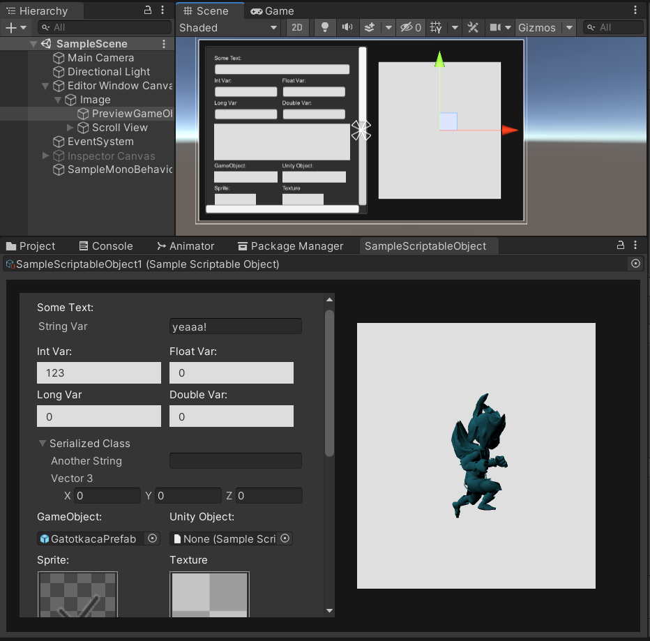
How Does It Work?
This tool mainly consists of 4 kind of features:
-
Converters
Converter components should be attached in root Canvas GameObject. This handles UI conversion by traversing all child GameObjects, converting RectTransform layouts and UI components into the target UI system type.-
UGUI To UI Toolkit Converter (Experimental)
Converts uGUI (Unity UI) of a whole canvas into UI Toolkit runtime UI Document. -
UGUI To UI Toolkit Editor Window Converter (Experimental)
Converts uGUI (Unity UI) of a whole canvas into UI Toolkit Editor Window. -
UGUI To UI Toolkit Inspector Converter (Experimental)
Converts uGUI (Unity UI) of a whole canvas into UI Toolkit Custom Inspector of a Component. -
UGUI To IMGUI Editor Window Converter
Converts uGUI (Unity UI) of a whole canvas into UI Toolkit Editor Window. -
UGUI To IMGUI Inspector Converter
Converts uGUI (Unity UI) of a whole canvas into UI Toolkit Custom Inspector of a Component.
-
UGUI To UI Toolkit Converter (Experimental)
-
Element Attributes
Element Attribute components should be attached in an element GameObject. This adds a specific behaviour towards an element.-
Draggable Element
This component enables draggable behavior to an element. The dragged element priority will be automatically chosen from the highest child index in canvas’ transform hierarchy.
-
Draggable Element
-
Element Binders
Element Binder components should be attached in an element GameObject. This handles property or method binding with SerializedObject, so please note that this only works for Editor. If you want to bind UI Toolkit elements with runtime objects, then you might want to bind VisualElement using C# scripts instead.-
Field Binder
Handles binding of an object’s property with field and control elements. If field/control is not specified, then the conversion will automatically detect the corresponding element type inside the RectTransform based on the specified data type. -
Method Binder
Handles binding of an object’s method with a button element. This component is specifically used alongside with a Button component only. -
Text Binder
Handles binding of a stringified object’s property with a text element. This component is specifically used alongside with a Text or TextMeshPro (Text UI) component only.
-
Field Binder
-
Layout Controllers
Layout Controllers are objects that allows us to control element's transform (IMGUI and UI Toolkit) using similar methods we use in uGUI Layout (e.g. RectTransform, Layout Groups). This enables hybrid approach for people who are still unfamiliar to control or animate UI in other UI systems other than uGUI.-
UITK Rect Transform (Experimental)
Controls element's transform of UI Toolkit's Visual Elements using simlar methods as Rect Transform. -
IMGUI Rect Transform (Experimental)
Controls element's transform of IMGUI elements using simlar methods as Rect Transform.
-
UITK Rect Transform (Experimental)
As this tool utilizes uGUI / Unity UI Canvas, it is important to have basic knowledge of it. You can also learn from the examples and figure it out with the provided demo scenes. The Demo Scenes are divided into Unity 2018 and Unity 2020, because all built-in Canvas UI components are not compatible between Unity 2018/2019 and 2020+, as they’ll show missing components if opened using different version of Unity.
Installation
These installation steps are mandatory only if you're using Unity 2019.3 or above. Otherwise, you can skip these steps, and use this tools right away.
- Installing UI Toolkit Package
- Installing UI Builder Package
Converters
Converting into Runtime UI Document (UI Toolkit)
There is a specific converter component called uGUI To UI Toolkit Converter component that we need to add to the root canvas game object. This is used for general uGUI to UI Toolkit conversion, mainly for runtime to be used as UI Document gameobject. Hence, it can't contain editor tags on its UXML / VisualTreeAsset.
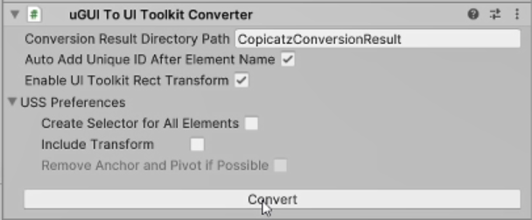
- Conversion Result Directory Path: The location path of the generated files as the result of conversion.
- Auto Add Unique ID After Element Name: An automated uniqie id generation after element name to provide an ease of querying UI elements by script for usages after conversion.
- Enable UI Toolkit Rect Transform: (To be renamed into Enable Layout Controllers later) Enables functionality to control the generated layouts using methods similar to uGUI (Rect Transform, Layout Groups, etc)
-
USS Preferences: Contains preferred configuration of the generated USS (StyleSheet).
- Create Selector for All Elements: By default, the converted USS doesn’t create selector for VisualElement and Label, as it can be stylized inside UXML. But by checking this on, all element styles (except transform styles if you turned it off) will be included in USS.
- Include Transform: By default, all converted transform styles are written on UXML only. But by checking this on, all element transform styles will be included in USS, so that the UXML only contains the type definition and its hierarchy.
- Remove Anchor and Pivot if Possible: Each uGUI Rect Transform are converted into 3 VisualElements by default: Anchor VisualElement, Pivot VisualElement, and the VisualElement for the actual element itself. If you turn this on, remove anchor and pivot for certain elements that meet the conditions to be able to be removed (e.g., having anchor and pivot at the same corner). This is to optimize VisualElements usage. You can't turn this on if you enable Layout Controllers, because anchor and pivot are required in order to control the VisualElement.
Converting into Editor Window
Required Components:
Canvas, Canvas Scaler, Rect Transform Add this component to the root canvas game object. There are 2 types of Editor Window Converter component, both have the same configurations:
-
uGUI To UI Toolkit Editor Window Converter (Experimental)
Specifically for uGUI to UI Toolkit Editor Window Converter component, configurations for UI Toolkit are also included as it is derived from uGUI To UI Toolkit Converter component. - uGUI To IMGUI Editor Window Converter
-
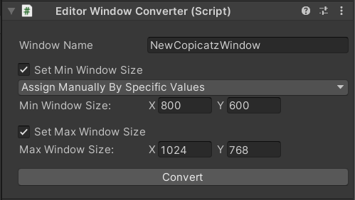
Window Name: Set the window title name and editor window generated script name.
-
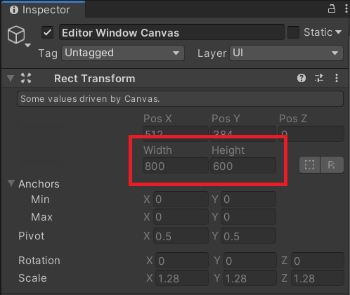
Assign Automatically by Canvas Width and Height: The min size will be taken from Canvas Rect Transform’s width and height.
-
Assign Manually by Specific Values: The min size will be taken from the Min Window Size field, ignoring the width and height of the Canvas Rect Transform.
- Min Window Size
-
Assign Automatically by Canvas Width and Height: The min size will be taken from Canvas Rect Transform’s width and height.
- Set Min Window Size: If not set, the min size would be automatically set to 100 x 100.
- Set Max Window Size: If not set, there will be no restriction of max window size.
- Convert: Convert the canvas into custom editor window, and generate the custom editor script.
Converting into Custom Inspector
Required Components: Canvas, Canvas Scaler, Rect Transform Add this component to the root canvas game object. There are 2 types of Custom Inspector Converter component, both have the same configurations:
-
uGUI To UI Toolkit Inspector Converter (Experimental)
Specifically for uGUI to UI Toolkit Inspector Converter component, configurations for UI Toolkit are also included as it is derived from uGUI To UI Toolkit Converter component. - uGUI To IMGUI Inspector Converter
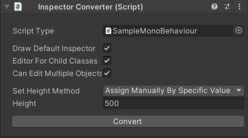
- Script Type: MonoBehaviour derived script that the inspector is referring to.
- Draw Default Inspector: Whether or not to draw default inspector above the custom inspector.
- Editor For Child Classes: Apply the custom inspector for script type’s sub-classes.
- Can Edit Multiple Objects: Show custom inspector when selecting multiple objects.
-
Set Height Method: The method used to set the custom inspector’s fixed height.
-
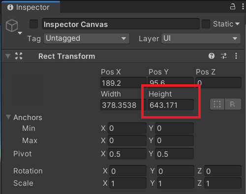
Assign Automatically by Canvas Height: The custom inspector’s height will be taken from Canvas Rect Transform’s height.
-
Assign Manually by Specific Value: The custom inspector’s height will be taken from the Height field, ignoring the height of the Canvas Rect Transform.
- Height
-
Assign Automatically by Canvas Height: The custom inspector’s height will be taken from Canvas Rect Transform’s height.
- Convert: Convert the canvas into custom inspector, and generate the custom editor script.
Canvas Scaler Compatibility
| Converter Component | Constant Pixel Size | Scale With Screen Size | Constant Physical Size | |
|---|---|---|---|---|
| UI Toolkit | UGUI to UI Toolkit Converter (Runtime) | ✓ | ✓ | ✓ |
| uGUI to UI Toolkit Editor Window Converter | ✓ | ✕ | ✕ | |
| uGUI to UI Toolkit Inspector Converter | ✓ | ✕ | ✕ | |
| IMGUI | uGUI to IMGUI Editor Window Converter | ✓ | ✓ | ✕ |
| uGUI to IMGUI Inspector Converter | ✓ | ✓ | ✕ |
Tips
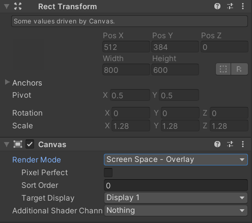
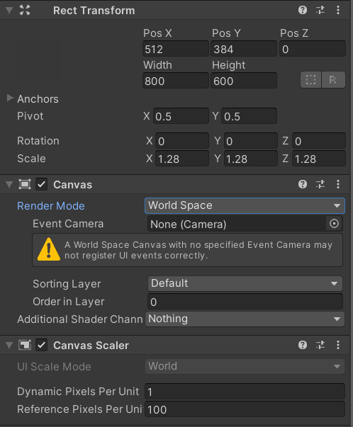
To get a better preview of your layout, you may want to see it in various screen sizes. In this case, if you choose Screen Space - Overlay Render Mode, then it would be impossible for you to change canvas’ width and height through scene or inspector. But if you choose World Space Render Mode, then you can edit the width and height. Please note that World Space Render Mode will automatically change the UI Scale Mode into Constant Pixel Size, so you might want to change the Render Mode back to Screen Space – Overlay if you want to choose Scale With Screen Size Scale Mode, once you’ve done with your previewing.
List of Convertible UI Components
-
Image
Tweakable Image component values:- Source Image
- Color
- Image Type (Simple & Sliced)
-
Text
Tweakable Text component values:- Text
- Font
- Font Style
- Font Size
- Alignment
- Color
- Horizontal & Vertical Overflow
- Content Type: Password & Pin
-
Input Field
This field can also be used for primitive types (string, int, long, float, double) in Editor. Tweakable Input Field component values:- Text Component
- Image Component
- Line Type
- Normal Color
- Highlighted Color
- Pressed Color
- For UI Toolkit Only: Selected Color
-
Scroll View
Tweakable Image component values: (same as Image)
For UI Toolkit Only:- Horizontal & Vertical Toggle
- Movement Type
- Inertia & Deceleration Rate
- Elasticity
-
Toggle
Tweakable Toggle component values:- Target Graphic (if the target is deleted, then it will draw the editor's default toggle style)
-
Enum Dropdown (Currently for Editor Only)
Tweakable Dropdown component values:- Options
- Normal Color
- Highlighted Color
- Pressed Color
-
Int Enum Dropdown (Currently for Editor Only)
Tweakable Dropdown component values:- Options
- Normal Color
- Highlighted Color
- Pressed Color
-
Slider
Tweakable Slider component values:- Min Value
- Max Value
- For UI Toolkit Only: Direction
- For IMGUI Only: Whole Numbers
-
Scrollbar (Experimental - Only for UI Toolkit)
Tweakable Scrollbar component values:- Direction
-
Object Field (Editor Only)
-
Sprite / Texture Field (Editor Only)
-
GameObject Previewer (Editor Only)
-
Default Property Field (Editor Only)
Creates default property based on the property type. Mainly used for structs and serializable classes because the field stylings can't be customized, but basically can be used to draw default property field for any property type as well.
-
Button
Tweakable Button component values:- Target Graphic
- Normal Color
- Highlighted Color
- Pressed Color
- For UI Toolkit Only: Selected Color
Element Attributes
Draggable Element
Add this component to enable draggable behavior to an element. The dragged element priority will be automatically chosen from the highest child index in canvas’ transform hierarchy.
Element Binders
Element Binder components should be attached in an element GameObject. This handles property or method binding with SerializedObject, so please note that this only works for Editor. If you want to bind UI Toolkit elements with runtime objects, then you might want to bind VisualElement using C# scripts instead.
Please not that these are only alternative approaches, as you can also directly modify the generated UI after conversion by script, without utilizing any of these Element Binder components.
Field Binder
Add this component to the canvas’ child element game object.
-
Target Object Selection Method
-
Choose From Object Field: Refer property’s object reference from other Field Binder which property path is referring to a Unity Object.
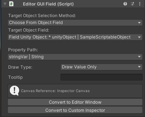
- Target Object Field: Other Editor GUI Field in the same canvas root which property path is referring to a Unity Object.
-
Open Object Picker: Refer property’s object reference directly by picking unity object in Assets.
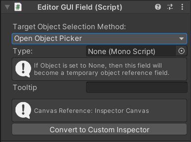
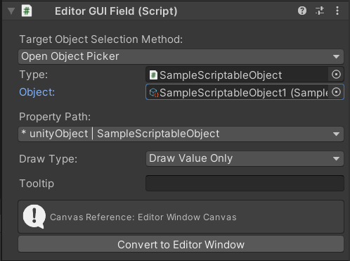
- Type: Object type to pick.
-
Object: Object reference of the field.
-
If it’s set to None, then the field will become a temporary object reference field and not serialized. A temporary object reference may come in handy to be used as referred Object Field for other Object Fields, for example when you have many objects of the same type, and you want to choose one object to edit, as seen on image below.
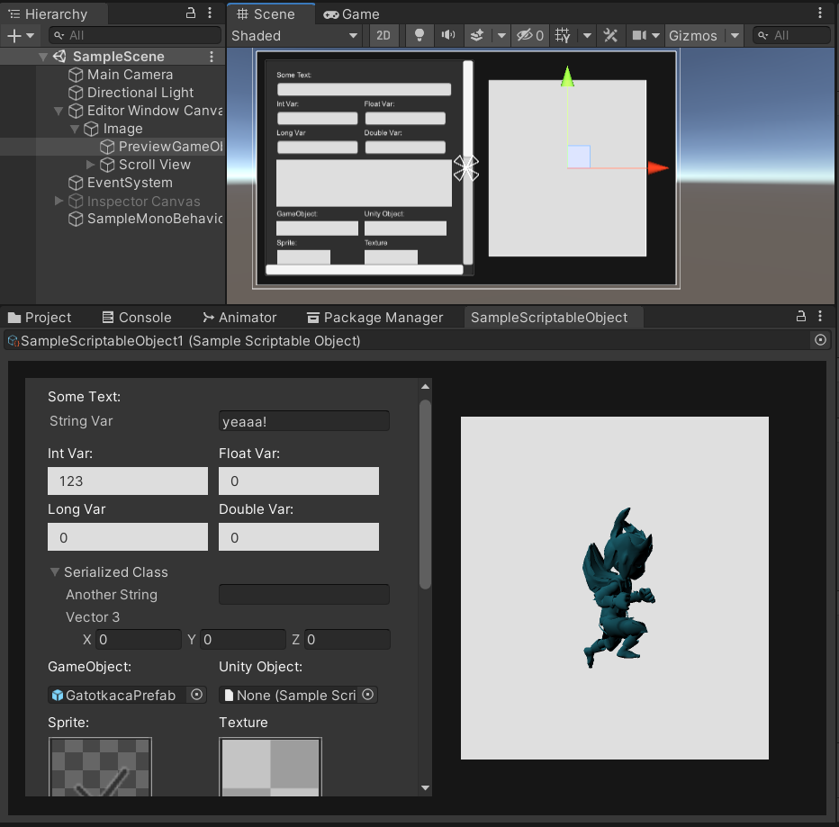
As we can see on the image above, the red-circled field is a temporary object reference field, and the rest fields below are property fields referring to the selected temporary object reference. If the temporary object reference is not yet selected (None), then the other fields referring to it will be disabled as they don’t know which object to refer to.
-
If it’s set to None, then the field will become a temporary object reference field and not serialized. A temporary object reference may come in handy to be used as referred Object Field for other Object Fields, for example when you have many objects of the same type, and you want to choose one object to edit, as seen on image below.
-
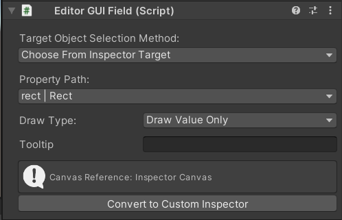
Choose From Inspector Target: Refer property’s object reference to current serialized object in inspector of selected GameObject in hierarchy. Please note that this can only be used on elements which root canvas has the Inspector Converter component.
-
Choose From Object Field: Refer property’s object reference from other Field Binder which property path is referring to a Unity Object.
- Property Path: The referred property of the target object to edit in the field. Property that refers to a unity object is marked with *.
-
Draw Type
- Draw Value Only: Draw value without label.
- Draw Default Property: Use default property drawer. This also includes the label. All the stylings in inspector (e.g., from Image and Text Component) are ignored.
- GameObject Previewer: Draw GameObject preview. Please note that this can only be applied on property path that refers to a GameObject.
- Tooltip: Tooltip of the field. Tooltips are only shown on labels, so it mostly will not be shown when you choose Draw Value Only.
- Convert to Custom Inspector: A shortcut to root canvas’ Inspector Converter’s (if there is any) Convert button.
- Convert to Editor Window: A shortcut to root canvas’ Editor Window Converter’s (if there is any) Convert button.
Method Binder
Add this component to the canvas’ child element game object. Add it alongside a Button component to do custom button styling.
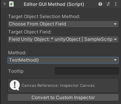
Method Binder mostly has the same configurations with Field Binder. The difference is that is has Method selection instead of Property Path. The selected method will be called when the element is clicked.
Text Binder
Add this component to the canvas’ child element game object that has a Text component.
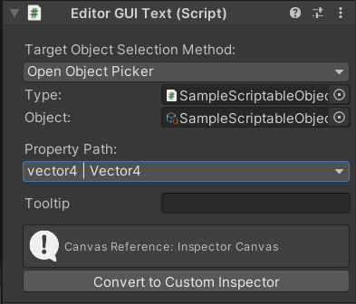
Text Binder mostly also has the same configuration with Field Binder. The difference is that instead of generating a Field for editing, it will get the stringified value of the property and show it as a text.
Layout Controllers
Layout Controllers are objects that allows us to control element's transform (IMGUI and UI Toolkit) using similar methods we use in uGUI Layout (e.g. RectTransform, Layout Groups). This enables hybrid approach for people who are still unfamiliar to control or animate UI in other UI systems other than uGUI.
In any uGUI to UI Toolkit converter components, this feature can be enabled simply by checking on Enable Layout Controllers toggle.
UITK Rect Transform
Controls a VisualElement's transform using methods similar to uGUI's Rect Transform.
Example:
IMGUI Rect Transform
(placeholder)
Notes
- Any features involving UI Toolkit are experimentals, as UI Toolkit package is still in previews.
- Rotating UI Element is not yet supported for IMGUI.
- Rotating UI Element is supported for UI Toolkit, but for element that has stretched anchor, the pivot will always be on top left.
-
Image with Sliced Image Type’s borders / slices are at constant pixels and currently can’t be scaled. This priors to inavailability of changing Reference Pixels per Unit in both IMGUI and UI Toolkit.
- UI Toolkit: Using sprite of a spritesheet of one image file is not supported in UI Toolkit. Instead, you can either use only one file for each sprite, or use the new Sprite Atlas system.
- Layout Groups support will be added in the upcoming versions.
- Currently there is no Editor drawer for reorderable list and dictionary. You can still draw the default List/Array property using the current provided feature. But we will support drawers for Reorderable List and Dictionary in the future. So, stay updated!
Support
If you have any questions or difficulties regarding this tool, or even some requests, you can send an email to affan@calcatz.com and we’ll gladly help you.